
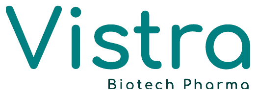
Logo concept
The helix grows out of the letters: dots for careful research, rungs for the double helix, a diagonal climbing towards progress. The mark is placed from master files, never redrawn.
The identity of a pharmaceutical and Ayurveda company from Patna: a DNA mark, two teals, two typefaces and a 15-page book that holds the rules.
Vistra Biotech Pharma markets and distributes pharmaceutical and Ayurvedic medicines across India. Every product is made by a certified partner facility, named on its pack, and marketed by Vistra from Patna.
The identity had to hold both halves: clinical precision from modern pharmacology, and therapeutic depth from classical Ayurveda.
Dependable healthcare, accessible across India: modern pharmaceutical science and traditional Ayurveda under one trusted name.
Consistently high-quality medicines from certified partner facilities, backed by multi-stage quality control and real support for partners.
Quality without compromise. Scientific and Ayurvedic integrity, with no unsupported claims. Transparent, long-term partnership.
“Science is not added to the brand, it is part of its name.”From the logo concept
The helix grows out of the letters: dots for careful research, rungs for the double helix, a diagonal climbing towards progress. The mark is placed from master files, never redrawn.
One unit, x, the height of the capital V. Every proportion, the clear zone and the minimum sizes are measured in it, so a placed logo can always be checked against the master.
Two teals from the logo lead; lighter teals fill and chart. Gold and coral sit opposite teal on the colour wheel, so a little goes a long way. Five percent at most.
Excellence in every dose
Comfortaa shares the rounded geometry of the logo and carries headlines, product names and big numbers. Nunito Sans carries body text, compositions, tables and regulatory copy.
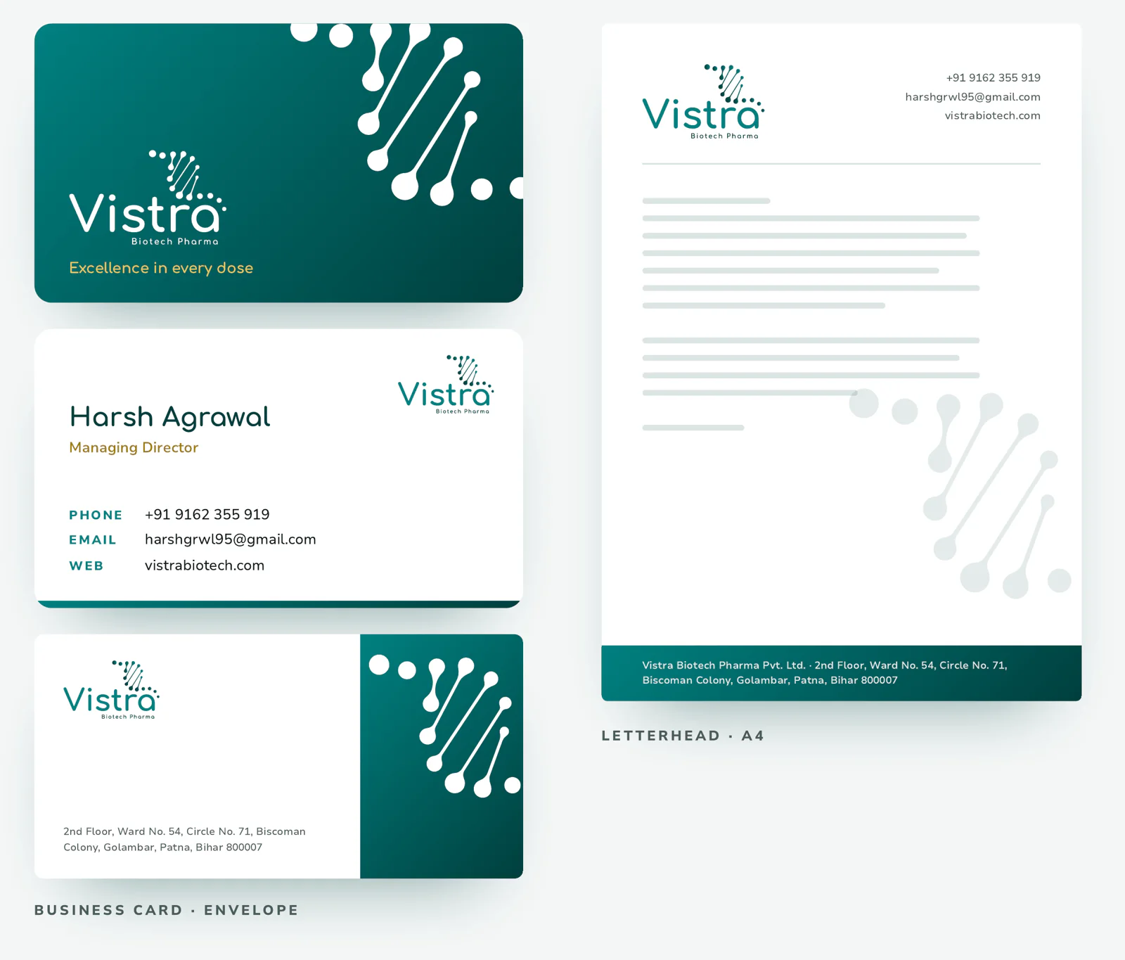
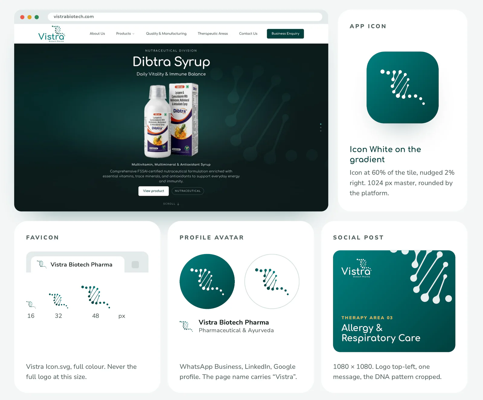
This page shows the thinking. The book holds every rule: 15 pages, from the mark and its misuse to the stationery and the app icon.
Tell us where you are today. We will reply within 48 hours with what we would do first, and what it would take. No pitch deck, no obligation.