logo design · 2026

Vistra Biotechlogo

A DNA pattern joined to the Vistra wordmark: a pharma brand that reads as science, stated plainly.

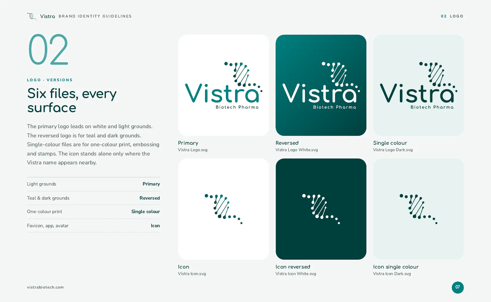
Vistra Biotech Logo, full colour
Primary · on light
Vistra Biotech Logo, reversed
Reversed · on the brand colour
Vistra Biotech Logo icon
Icon
Vistra Biotech Logo icon, reversed
Icon · reversed
the idea behind it

What the mark says

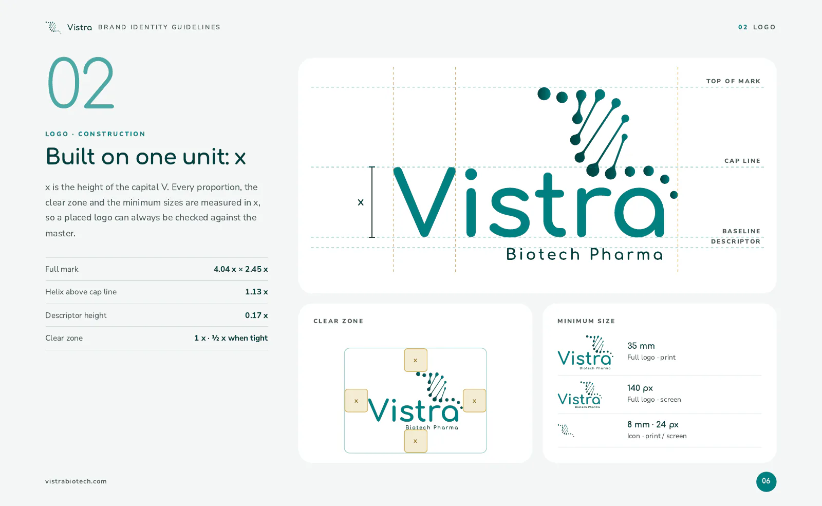
Vistra Biotech Logo: how the mark is put together

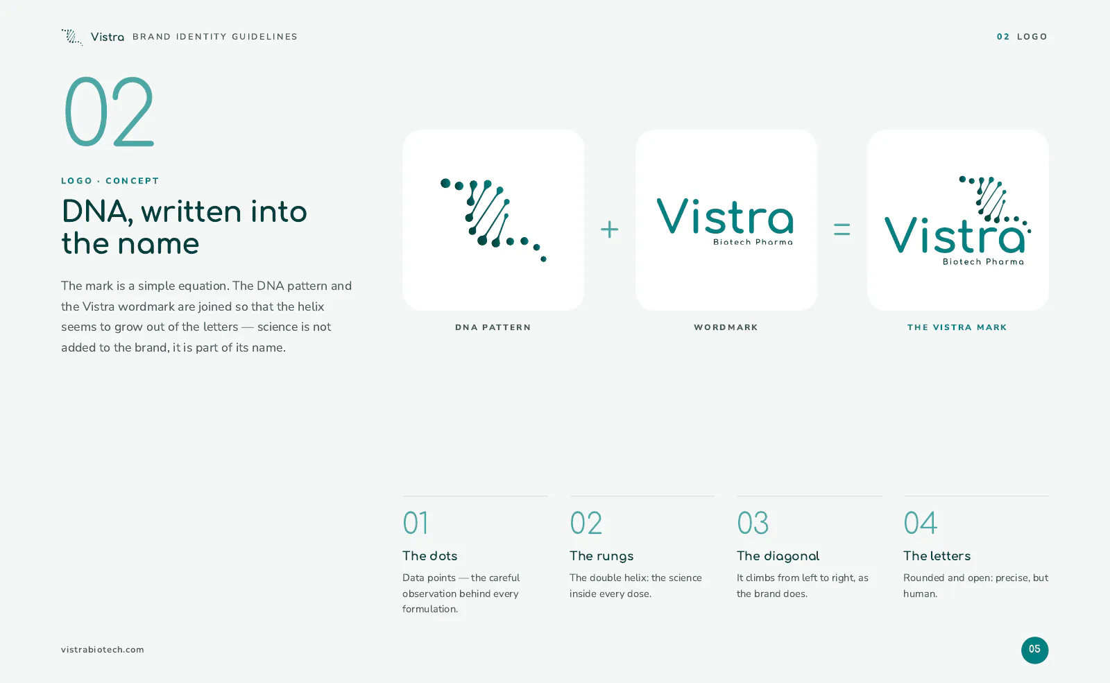
The logo joins a DNA-inspired pattern to the Vistra wordmark, a visual link between the brand name and the science behind it. A simple combination of DNA and Vistra makes a distinctive mark that stands for scientific knowledge and continuous innovation.

  • The DNA patternResearch, precision and structure: every node sits on a circle, every strand runs between two.
  • The wordmarkSet in Comfortaa: rounded, open and approachable, so medicine feels trustworthy rather than cold.
  • Teal and goldPrimary Teal for the mark, Teal Dark for depth, Accent Gold for the premium touches.
  • Primary Teal#008080
  • Teal Dark#003F3D
  • Teal Light#4DA8A5
  • Accent Gold#C9A227
from the guide

How it is used

  • Vistra Biotech Logo guide, page 1
  • Vistra Biotech Logo guide, page 2
  • Vistra Biotech Logo guide, page 3
tell us where you want to go

Your mark next?

Tell us where you are today. We will reply within 48 hours with what we would do first, and what it would take. No pitch deck, no obligation.

  • Free first review of your website and marketing
  • A clear plan, even if you do it yourself
  • Straight answers from the people who build it
Keval Shera
you will hear back from meKeval SheraCo-founder & CEO