Logo design Prominent TechnoLabs
Two ideas. One mark.
A speech bubble and a set of nested squares, drawn as one shape. It says what the agency does: we talk with you, and we build it right.
One shape that says two things.
Drawn to one unit, not by eye.
Only squares, right angles and one corner radius. X is the side of the inner square, and every other length in the mark is a multiple of it.
- Inner square
- X
- Bracket stroke
- 0.72 X
- Window gap
- 0.56 X
- Body
- 3.55 X
- Tail depth
- 1.20 X
- Overall height
- 4.76 X
The master files are the authority. The mark is always placed from them, never redrawn or re-spaced by hand.
Simple shape. Nothing random.
Three versions. One set of rules.
Pick the version by the shape of the space, then the file by the background. Nothing is recoloured or rebuilt.
The default. Website headers, decks, documents, invoices: anywhere there is width.
- White#FFFFFF · Full colour
- Slate 200#E4E5EA · Full colour
- Navy#0A2463 · Reversed
- Orange#FF6600 · All white

Clear space a quarter of the symbol’s height, on every sideSmallest 150 px for the lockup, 24 px for the symbolOn a photo always on a solid panel from this set
Off the page and into the work.
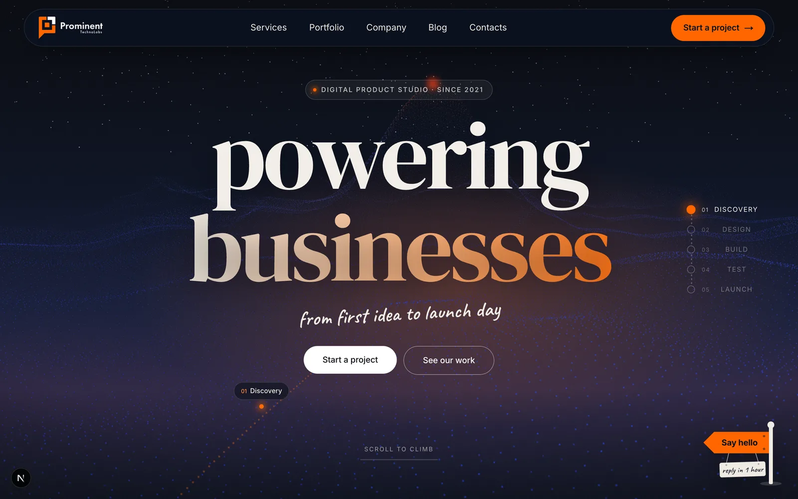
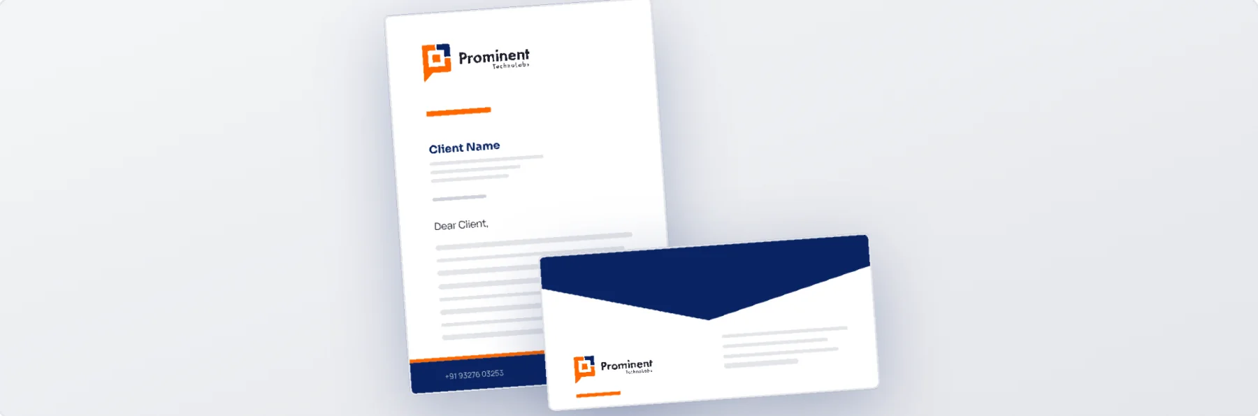
Every rule, written down.
Clear space, minimum sizes, all six files, colour, type and the don’ts are set out in the 26-page brand book.
- 01Cover
- 07Construction
- 10Logo variants
- 12On backgrounds
Your mark next?
Tell us where you are today. We will reply within 48 hours with what we would do first, and what it would take. No pitch deck, no obligation.
- Free first review of your website and marketing
- A clear plan, even if you do it yourself
- Straight answers from the people who build it