Shape Image
Shape Image

Project Summary

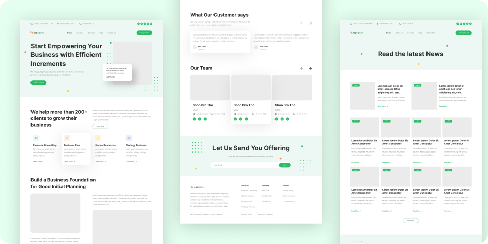
The Business Website project focuses on designing a visually appealing and functional website template that caters to businesses seeking to establish a professional online presence.

The design emphasizes modern aesthetics, user experience, and brand alignment, ensuring that businesses can effectively communicate their value propositions to their target audiences.

The design is created using Figma, providing a collaborative and flexible environment for design iterations and feedback.
  • Professional Online Presence: Create a website that establishes credibility and professionalism for businesses across various industries.
  • Brand Consistency: Ensure the website design aligns with the client’s brand identity, including color schemes, typography, and imagery.
  • User-Centric Design: Focus on a design that enhances user experience, making it easy for visitors to navigate and find information.
  • Responsive Design: Develop a design that is fully responsive, ensuring optimal performance on desktops, tablets, and mobile devices.
  • Clear Call-to-Actions (CTAs): Design clear and compelling CTAs to drive user engagement and conversions.
  • Visual Hierarchy: Implement a strong visual hierarchy to guide users through the website’s content effectively.
  • Content Flexibility: Create a design that allows for easy content updates and adjustments without compromising the visual integrity.
  • SEO-Friendly Design: Ensure the design supports search engine optimization (SEO) best practices, including clean code and fast loading times.
  • Integration of Multimedia: Incorporate multimedia elements such as images, videos, and icons that complement the overall design and content.

  • Brand Alignment: Ensuring the design aligns with diverse brand identities.
  • Responsive Design: Maintaining design consistency across different devices and screen sizes.
  • User Engagement: Designing CTAs that effectively drive user actions.
  • Content Management: Allowing clients to easily update content without disrupting the design.
  • Visual Hierarchy: Guiding users through the content in a logical and engaging manner.
  • SEO Considerations: Balancing aesthetic design with SEO requirements.
  • Client Collaboration: Managing client feedback and design iterations.
  • Consistency Across Pages: Maintaining a consistent design across multiple pages of the website.
  • Incorporating Multimedia: Integrating multimedia without affecting page load times.
  • Design Handoff: Ensuring a smooth transition from design to development.

  • Brand Alignment: Develop customizable design elements, including color schemes and typography, to match each client’s brand.
  • Responsive Design: Use a flexible grid system and responsive design techniques to ensure the layout adapts seamlessly.
  • User Engagement: Implement prominent and strategically placed CTAs with attention-grabbing colors and text.
  • Content Management: Use a modular design approach that separates content from design elements, allowing for easy updates.
  • Visual Hierarchy: Utilize size, color contrast, and spacing to create a clear visual hierarchy that directs user attention.
  • SEO Considerations: Ensure that the design includes SEO-friendly elements such as fast loading times, clean code, and optimized images.
  • Client Collaboration: Leverage Figma’s collaboration features to allow clients to provide real-time feedback and participate in the design process.
  • Consistency Across Pages: Create a design system with reusable components and styles to ensure consistency.
  • Incorporating Multimedia: Optimize multimedia files and use lazy loading techniques to enhance performance.

  • Enhanced Brand Representation: Successfully created a design that aligns with and enhances the client’s brand identity.
  • Improved User Experience: Designed a user-friendly interface that simplifies navigation and enhances user satisfaction.
  • Responsive and Adaptive Design: Achieved a fully responsive design that provides a consistent experience across all devices.
  • Increased User Engagement: The design includes effective CTAs that have improved user interaction and conversion rates.
  • SEO-Optimized Design: Implemented design elements that support SEO best practices, contributing to better search engine rankings.
  • Streamlined Content Management: Developed a flexible design that allows clients to update content easily without requiring design changes.
  • Efficient Collaboration: Used Figma’s collaboration tools to streamline the design process, incorporating client feedback effectively.
  • Consistent Visuals: Maintained design consistency across all pages, ensuring a cohesive and professional appearance.
  • Effective Multimedia Integration: Integrated multimedia elements that enhance the website’s visual appeal without compromising performance.
  • Successful Design Handoff: Provided a smooth transition from design to development, with clear guidelines and assets delivered in Figma.

  • Design Tool: Figma for creating and collaborating on the design, with features for real-time feedback and iteration.
  • Responsive Design: CSS Flexbox and Grid for creating responsive layouts that adapt to various screen sizes.
  • Typography: Google Fonts for versatile and web-friendly typography options.
  • Color Management: Adobe Color for creating and managing color schemes that align with the client’s brand identity.
  • Iconography: Font Awesome and custom SVG icons for a consistent and scalable icon set.
  • Image Optimization: TinyPNG and ImageOptim for compressing images to reduce load times while maintaining quality.
  • Prototyping: Figma's interactive prototyping features to create and test user flows and interactions before development.
  • Design System: A well-organized design system within Figma, including reusable components and style guides for consistency.
  • SEO Tools: Lighthouse for auditing the design’s performance and SEO readiness.